
AWS Wickr is an encrypted messaging chat application known for its privacy and security features. After identifying a customer pain point that exposed potential security concerns when users forgot to logout, our team decided to implement a new feature that would bridge the design-user gap and create a business opportunity at the same time.
NOTE: For copyright reasons, the featured UI screenshots are mockups I created to represent the actual product
The Challenge
Our customer needed a solution to the potential security vulnerabilities caused by users forgetting to logout. From interviews conducted with a group of 12 users, I discovered that leaving the application open in the background, when switching to other tasks is the main scenario a user forgets to come back and logout. While reminders can be given to the users to logout, a more automated solution could reduce the need for reminders and mental load on the users.
The Solution
The solution was to implement “Timed Sessions” for an organizations network. When enabled, a logged in user will have a limited amount of time in their session before they are logged out when the timer runs out. My role was to design the desktop UI/UX as well as implement the feature in our codebase. The desktop flow would render a modal that reminds the user that their session is expiring and allow them to refresh the session. If they are logged out, proper messaging will be displayed on the login screen to give the user sufficient context.


In collaboration with the product team and engineering team, I iterated on the modal design based on the projected user personas. I decided our design would focus more on a gentle but actionable reminder in order to minimize the disruption of the users’ ongoing tasks during a session. I used our application’s existing modal component and iterated on the contents within.
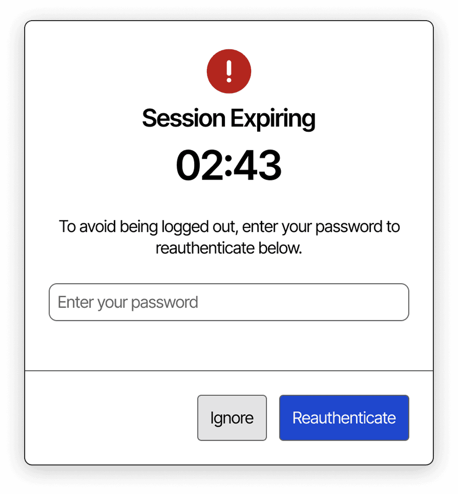
In our initial brainstorming, I wanted to highlight the urgency of the upcoming session expiration using attention grabbing elements such as red warning signs and a live countdown with the remaining time shown. I did not go through with this as I discovered our users do not need to prioritize reauthenticating a session, so I did not want to “scare” them into reauthenticating, which would also disrupt their flow in the active session.

To align our design with the above concerns, I chose different wording and imagery to soften the messaging when the modal would appear. Now, the red warning icon is replaced with a clock icon in the neutral black color. The large countdown timer has been replaced by smaller paragraph text that serves the same purpose but with a format that does not demand the user’s attention. Overall, internal tests revealed this was a more acceptable approach, and did away with the “panic” users felt in the initial design.
After simulating different scenarios a user could be in when the modal appears, I saw the initial design did not provide an affordance for those that ignore the modal, but then would like to reauthenticate after some time before they are logged out. As such, I proposed a design that incorporated a menu button for the user to freely access the session timeout modal after the modal first appears.

After I implemented the design in the actual product it was released in the internal beta environment for monitoring actual usage. After 2 weeks of testing, users reported satisfaction with the feature with no critical design issues. With the success of the testing, we planned for the production release, and drafted plans to use this new feature for future marketing points for the product.
• I was able to propose a design that both solves a user pain point and provides a business opportunity.
• The new feature would build trust with our current customers, and be a selling point to future customers.
• Bringing in the team and stakeholders early and often when making design decisions allows for productive iteration to happen rapidly.
• AI tools integrated in the design workflow can jumpstart brainstorming and planning by giving a variety of generated designs to be used as inspiration.
Get in touch
Feel free to reach out!