Designing a Mobile-Responsive Web Experience for AWS Chime.

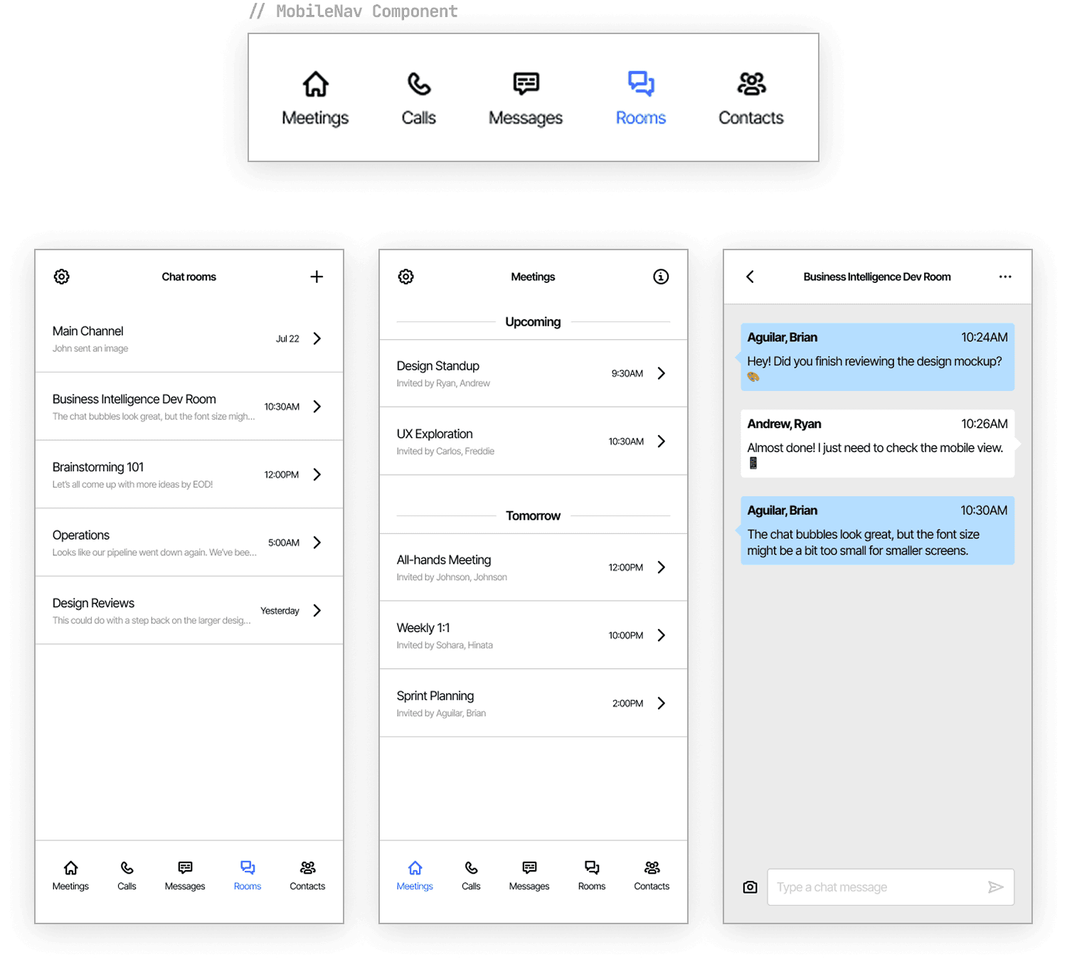
For copyright reasons, the featured UI screenshots are mockups created to represent the actual product.
The Challenge
The Problem
AWS Chime, a unified communications platform used by thousands of Amazon employees and external customers globally, had a critical gap—the web application was completely unusable on mobile browsers. While users had iOS and Android dedicated apps, they frequently found themselves on mobile devices without the apps installed.
The Constraint
Unlike greenfield projects, I couldn't redesign from scratch. I had to work within AWS's existing design system, component library, and technical architecture while making the platform truly mobile-functional, maintaining consistency with iOS and Android apps.
User Feedback: "I need to access Chime on my phone's browser when I don't have the app installed." This wasn't just a nice-to-have—it was blocking users from staying connected during critical work moments.

The Process
Research & Strategy
I started by analyzing existing mobile app design patterns, user feedback, common mobile use cases, and technical constraints. The key insight: users expected the mobile web experience to feel familiar to the native mobile apps. This meant adapting our design language, not creating something new.
Design Exploration
Navigation Redesign: The web version used a traditional sidebar navigation—efficient on desktop, but problematic on mobile. I explored several approaches:
01
Collapsible Sidebar
Felt cramped, reduced screen real estate
02
Tab-Based Navigation
Didn't match native app patterns
03
SELECTED
Bottom Navigation Bar
Familiar to mobile users, maximizes content space, matches iOS/Android conventions
Why Bottom Navigation: This pattern is used across leading mobile apps (Instagram, Twitter, YouTube) because users can navigate one-handed and content takes center stage. It also meant I could reuse design patterns already validated in our native apps, reducing design debt.
Design Decision & Rationale
Constraint-Driven Design: Rather than compromise, I worked within existing web components. Every UI element used existing web styles from our design system, which meant:
✓ Faster implementation for engineers
✓ Maintains design consistency
✓ Reduces technical debt
✓ Simpler handoff and QA
Cross-Platform Consistency: By adapting the web experience to match iOS/Android patterns, we created a unified experience and set the foundation for a future opportunity: replacing separate iOS and Android apps with web wrappers—a significant maintenance win.
The Solution
I created a mobile-responsive design for the Chime web application that preserved every feature of the desktop web app while making it genuinely usable on mobile browsers—no feature compromise, just thoughtful reorganization.
✓
Adapted Navigation
From sidebar to bottom tab bar for mobile viewports
✓
Optimized Layouts
For small screens without removing existing functionality
✓
Maintained Consistency
Across web, iOS, and Android platforms
✓
Used Existing Components
To streamline implementation and testing

Bottom navigation system adapted to match mobile app patterns
Collaboration & Execution
This project required close coordination across teams. I worked with:
Product Management
To prioritize which features were essential for mobile
Engineering
To audit technical constraints and identify component reuse
iOS/Android Designers
To ensure cross-platform consistency
QA
Through design iterations and validation testing
The design was completed within 3 months and deployed to Beta. Throughout, constant communication and iterative design reviews ensured we balanced product, design, and engineering concerns.

Outcomes & Impact
User Reception
Positive feedback increased post-launch. Users no longer experienced frustration accessing Chime on mobile—the experience was now purposeful and usable.
Strategic Opportunity
The consistency between web and native apps showed we could consolidate into a single web platform with native wrappers, reducing maintenance overhead for three separate codebases.

Key Learnings
1. Technical Audits Enable Better Design
Before designing, I conducted a thorough technical audit of existing components. This constraint-driven approach led to a solution that was both visually cohesive and technically feasible.
2. Consistency is Strategic
By matching iOS/Android patterns on web, I created a foundation for future platform consolidation. Small design decisions compound into strategic advantages.
This project taught me that design isn't just about aesthetics—it's about understanding user needs, respecting technical reality, and facilitating collaboration across disciplines. The mobile-responsive Chime experience exists today because we treated this as a user problem to solve, not just an engineering task to complete.